Thursday, 22 September 2022

Experiments for my Book Illustrations

 I've been working on my children's book illustrations. It has been written for many years, and now I am developing the illustration style.

Since the book is about how animals in the boreal forest prepare for winter and how they overwinter, in preparation for the beaver's page, I sampled some colours from a wintery scene and a beaver lodge, as seen below. I sampled some colours from these uploaded images in Procreate to create different palettes. 


I've got four palettes going from sourcing like this (see below). These will be the colours found in the book. There are a lot of colours because the illustrations are meant to be realistic. The palettes I have started are below. From top to bottom, they are called "Beaver" "Main Winter Field", "Main Autumn Hills", and "Summer Water" . I will use the Winter and Autumn ones generally and will have individual colour palettes for each animal. For example, "Beaver", which includes colours from the lodge (the picture above) and "Summer water" which is needed for the great blue heron in 'winter', as it goes south to the everglades. I will rename that one "great blue heron" for cohesion. 


Here is one early illustration of the "autumn beaver" as the beavers work on their lodge and gather sticks for a winter stash of food. I painted this illustration quickly in procreate with the "main autumn" palette. It gave me a rough idea of how the colours work together. I prefer more dimension though it was a helpful early study. 


Below is an early illustration of the winter side of the full spread. For this illustration, I painted the background colours in watercolour first, then scanned it to my email and uploaded the image into Procreate in my Ipad. I added more details in procreate. I might like to widen the lodge so that the beaver does not fall on the crease. 


In the illustration below, I downloaded the ink version of the scene and then made a new layer in procreate and drew within the lines. I like some of the dark inky outlines. I love the ground under the water. I am not a fan of how these evergreen trees are drawn. 


Here is another rendition of the same image, in procreate. I like the way the evergreens are drawn in this one and how the water turned out. I'd like to see the inky outlines on the sticks. That might be the only place I miss them in this.


Generally I'm happy with the progressions of the images. There is still more work to do! 

Since my youngest daughter is in preschool for 4 hours a week and my eldest is in school, I will have a bit of time to focus on the art for my children's book!


Sunday, 4 October 2015

Beatrice Alemagna--Author/Illustrator


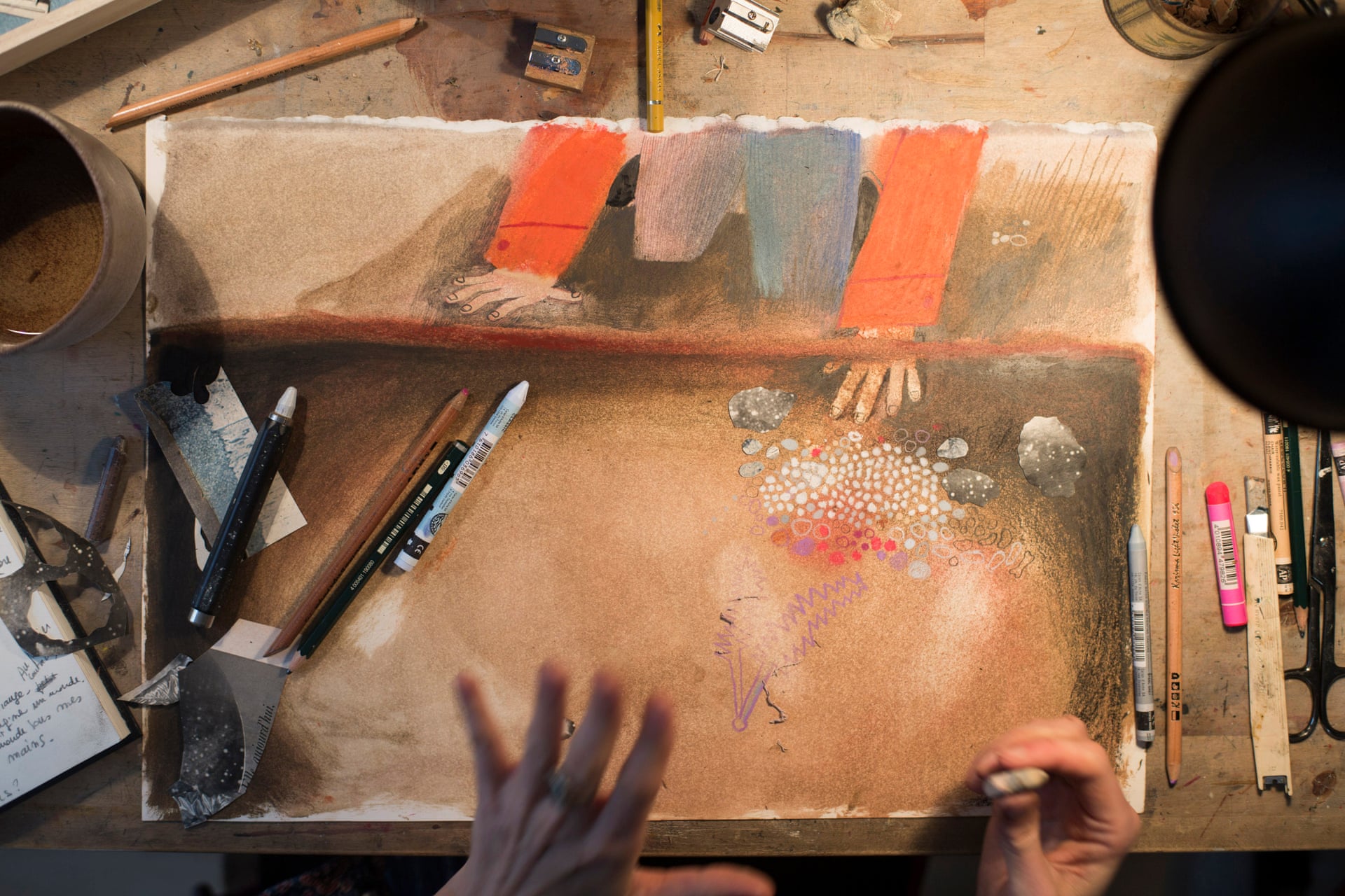
Illustration from 'Le Merveilleux Dodu-Velu-Petit' (The Wonderful Fluffy Little Squishy) by Beatrice Alemagna

"‘Le Merveilleux Dodu-Velu-Petit’ (The Wonderful Fluffy Little Squishy) is a book that required six years of reflection and two years of solid work."


I love THIS INTERVIEW

Beatrice draws Eddie and Fluffy HERE The video is unlisted on youtube, but you can see it through this link. It is amazing!!!! 

Saturday, 3 October 2015

Oliver Jeffers--Children's Book Author and Illustrator

I have been looking into the artist/illustrators on this webpage. Discovering that I own a children's book illustrated by him, called "The Day the Crayons Quit," I realized I was already a fan of his work.


This video highlights his process.


Love this article on Oliver's experience getting published for the first time.

Friday, 24 July 2015

Life Coach

Yesterday I began a conversation with my new life coach, Rebecca. She is doing her PhD and needs
practicum hours so I am helping her out. But really she is helping me out. Normally they charge $200/hr and I pay a tenth of that cost!

The conversation revolved around how I am spending my summer. It is clear to me now, after talking to her, that I value spending my time wisely. Following the rabbit hole of the internet is not as good to me as reading a book, painting a picture, or going for a bike ride!

She formatted the conversation thus: She asked for a goal, then what was being done to achieve that, then analyse what I valued, then decide how to better achieve that goal, then take that as homework.

So one of my goals was to plan relaxation in advance rather than just letting it happen. Previously I stuck a sticker to my calendar when I accomplished an activity--a smiley face for exercise; and a star for painting. However, this had become a bit of an afterthought as I filled it out at the end of the day. Having a plan for what I would paint and how I would exercise became important.

So, we talked about my values and how I would carry that out. At work, I enjoyed the freedom, this year, to make my own curriculum sheets and daily activity plans. At my last job we were given specific curriculum sheets and due dates. As a beginner, that helped, though now that I am adept at filling one of those out, having the curriculum sheets specialized and specific really made a difference to my planning activities and inquiries.

I formatted a curriculum sheet, used it for a week, formatted it again, used it for another week... until I felt good about it.

Recently I needed a calendar, so decided to DIM (Do-It-Myself), which should be no surprise, if you know me. I love making useful things personalized and beautiful! Plus it is easier on the budget. An important variable considering being an ECE in the school board means no paid summers. (A tiny price to pay for my dream job).


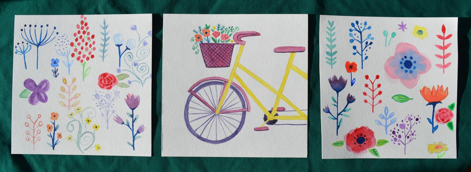
All things considered, I decided to DIM again and make a personalized and beautiful watercolour planner. And this is how it turned out!


Yesterday I planned to make two different paintings on my brand new trial watercolour paper* and ended up doing three, because, what joy it brings!!


* I tried out my new Fluid Watercolour Paper (Cold Press Finish) 6x6". The paper can be painted on while it is attached to the pad. It is attached at two sides, instead of one, essentially stretching out the paper to prevent buckling. OMG so helpful. Canson is quite terrible for the buckling problem, so what a difference! I am never going back. (Sorry makers of Canson, you are good student grade).

Sunday, 5 July 2015

Today's Trials

This summer, my project is to make a children's book. The rough draft of the manuscript is finished and has been sent to a friend from University who graduated with Eng Lit and has done some editing for books before! I look forward to her feedback. 

The idea is to create the artwork for this book as well. It is a science picture book and so needs a fair amount of accurate artwork so of course I want to do this part! I am realizing how much effort it takes and how frightening it is solely because I feel I am not a good enough artist! In any case, all I can do is improve. I have been reading/watching/listening to Christopher Sials Neal as he did beautiful and scientific artwork for one of my inspirations: Over and Under the Snow. And I kind of stole like an artist.
Watercolour, Pencil Crayon, Photoshop

Homemade stamp, Cheap school paint, Photoshop


Watercolour, Photoshop

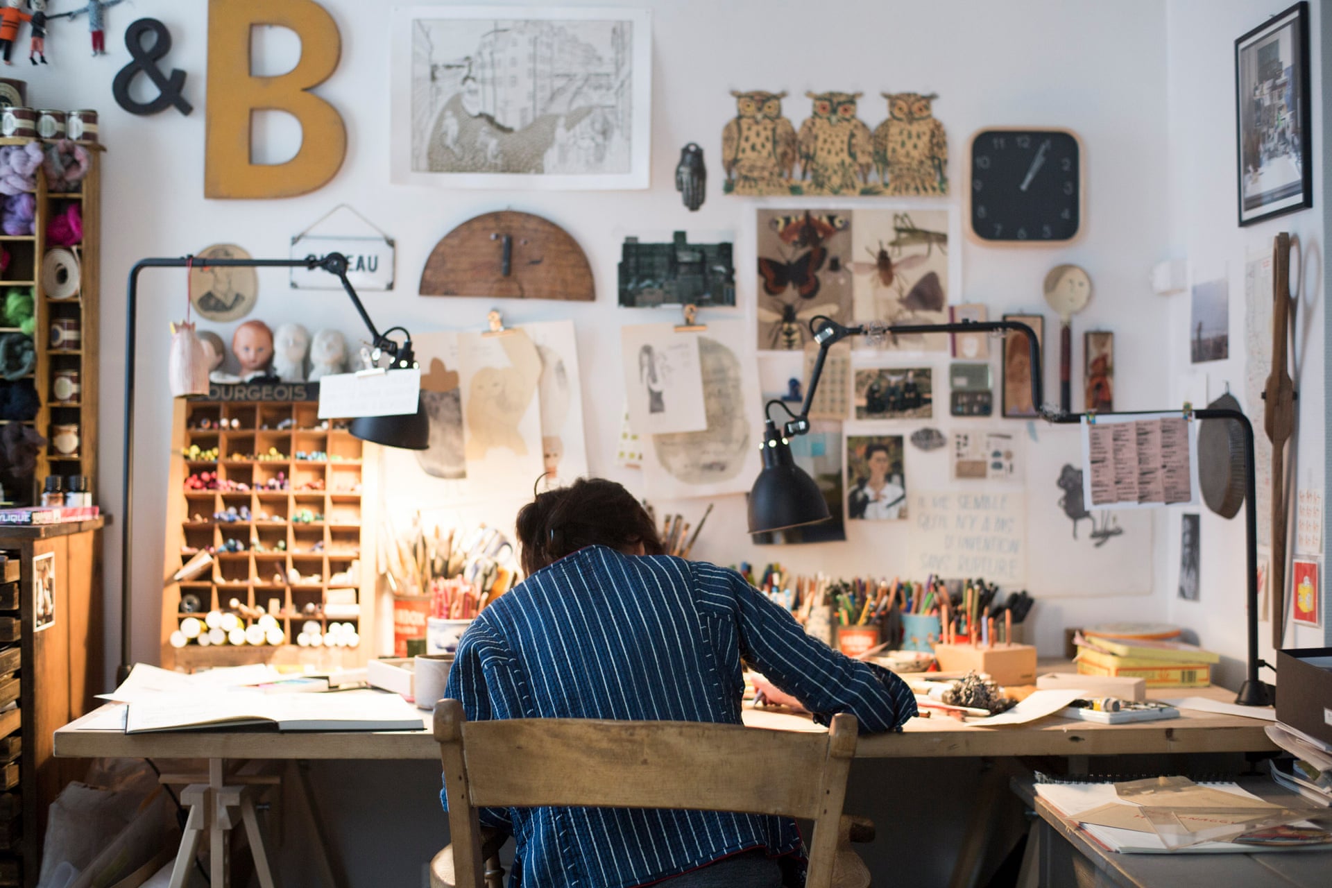
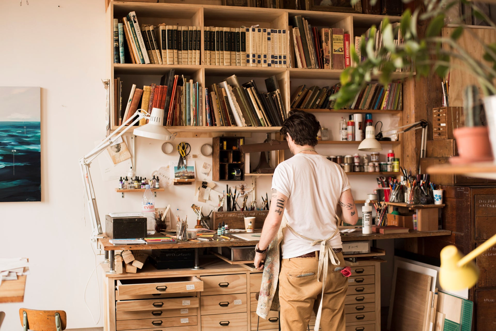
The Workspace of Christopher Silas Neal


Pictures by Art therapy