I've been working on my children's book illustrations. It has been written for many years, and now I am developing the illustration style.
Since the book is about how animals in the boreal forest prepare for winter and how they overwinter, in preparation for the beaver's page, I sampled some colours from a wintery scene and a beaver lodge, as seen below. I sampled some colours from these uploaded images in Procreate to create different palettes.
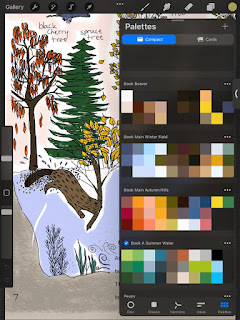
I've got four palettes going from sourcing like this (see below). These will be the colours found in the book. There are a lot of colours because the illustrations are meant to be realistic. The palettes I have started are below. From top to bottom, they are called "Beaver" "Main Winter Field", "Main Autumn Hills", and "Summer Water" . I will use the Winter and Autumn ones generally and will have individual colour palettes for each animal. For example, "Beaver", which includes colours from the lodge (the picture above) and "Summer water" which is needed for the great blue heron in 'winter', as it goes south to the everglades. I will rename that one "great blue heron" for cohesion.
Here is one early illustration of the "autumn beaver" as the beavers work on their lodge and gather sticks for a winter stash of food. I painted this illustration quickly in procreate with the "main autumn" palette. It gave me a rough idea of how the colours work together. I prefer more dimension though it was a helpful early study.
Below is an early illustration of the winter side of the full spread. For this illustration, I painted the background colours in watercolour first, then scanned it to my email and uploaded the image into Procreate in my Ipad. I added more details in procreate. I might like to widen the lodge so that the beaver does not fall on the crease.
In the illustration below, I downloaded the ink version of the scene and then made a new layer in procreate and drew within the lines. I like some of the dark inky outlines. I love the ground under the water. I am not a fan of how these evergreen trees are drawn.
Here is another rendition of the same image, in procreate. I like the way the evergreens are drawn in this one and how the water turned out. I'd like to see the inky outlines on the sticks. That might be the only place I miss them in this.
Generally I'm happy with the progressions of the images. There is still more work to do!
Since my youngest daughter is in preschool for 4 hours a week and my eldest is in school, I will have a bit of time to focus on the art for my children's book!


No comments:
Post a Comment